Revamp Hilton's Tableau Report Platform to Improve Exporting Performance
Enterprise Reporting
Dashboard
Enterprise SaaS
Tableau Redesign
Design System
Performance Optimization


Team
Project Manager
Developers
UX Designers
Skills
UX Research
UX Design
Design System
Design Validation & Iteration
Project Context
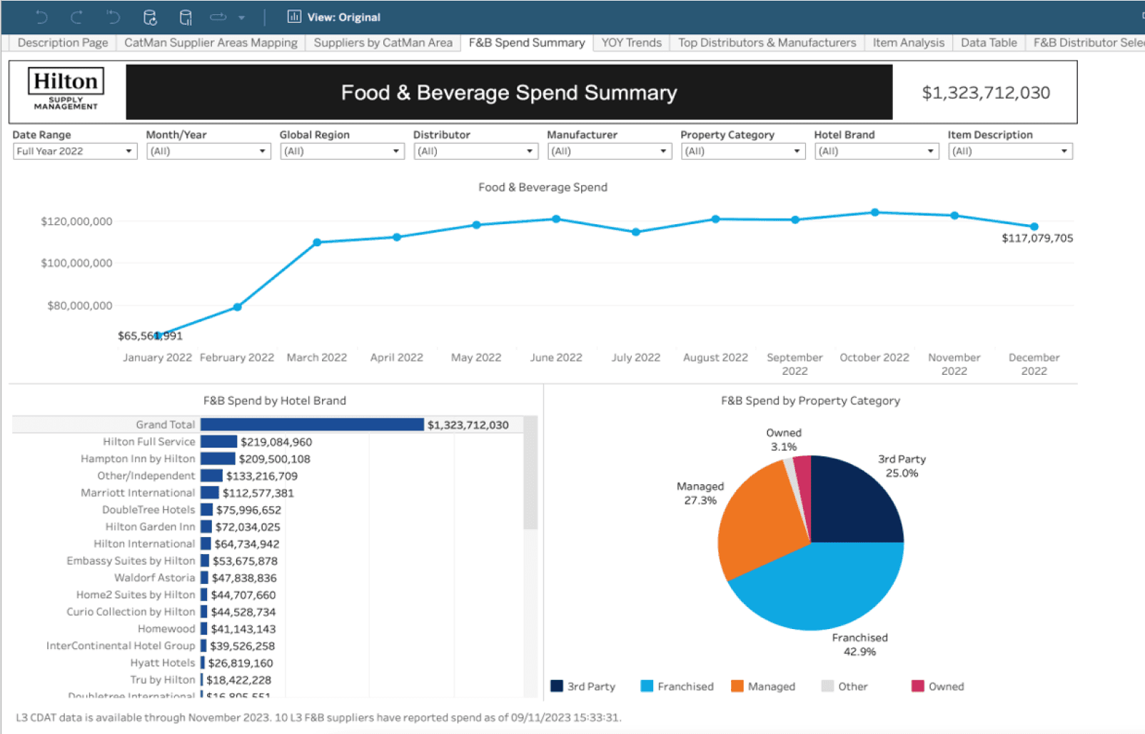
Hilton Report Tableau platform is used across Hilton Supply Management (HSM) for financial reporting, spend analysis, procurement tracking, and operational insights. It hosts dozens of reports that help teams track procurement spending, monitor supplier performance, and analyze revenue trends.
Project Goals
The platform had very poor performance issue with huge and unorganized datasets, making it inefficient and overwhelming for users. The UX redesign focused on improving performance, usability, readability and consistency of HSM’ s Tableau dashboard to support efficient report usage across teams.

Discover
Define
Design + Validation
Ready to hand off
UX Audit
Interviewees Screening
User Interviews
Design Requirements
Project Deadline
User Testing & Feedbacks
Design Iterations
Week 1-2
Week 3
Week 4-8
Week 9
Project Approach

Discover
Work with PM and developers to understand current platform capabilities and design boundaries
Walkthrough of current workflows and system limitations
Key Findings
9 report categories
87 active report files
6 data sources
Reports are downloaded as Excel and require heavy manual editing after exported.
It took user at lease 10 minutes+ to export a report.
70% of reports are table-based.
Interview participants screening to capture holistic perspectives
Top User Teams
Tableau Application Engineers
Accountants
Procurement Managers
Operation Managers
Top Used Reports
Custom Report Builder
Revenue Generating Spend
Hotel Spend Analysis
YOY Spend Analysis
Uncover user frictions to map needs, pain points, and improvement opportunities
User Interviews and Data Analysis
We interviewed 23 users across multiple Hilton teams (19 of them from top user teams) to discover:
Understand users' workflows and how they interact with current reports
Identify pain points in report usability
Explore opportunities for improvement
Gather input on team-specific collaboration and onboarding
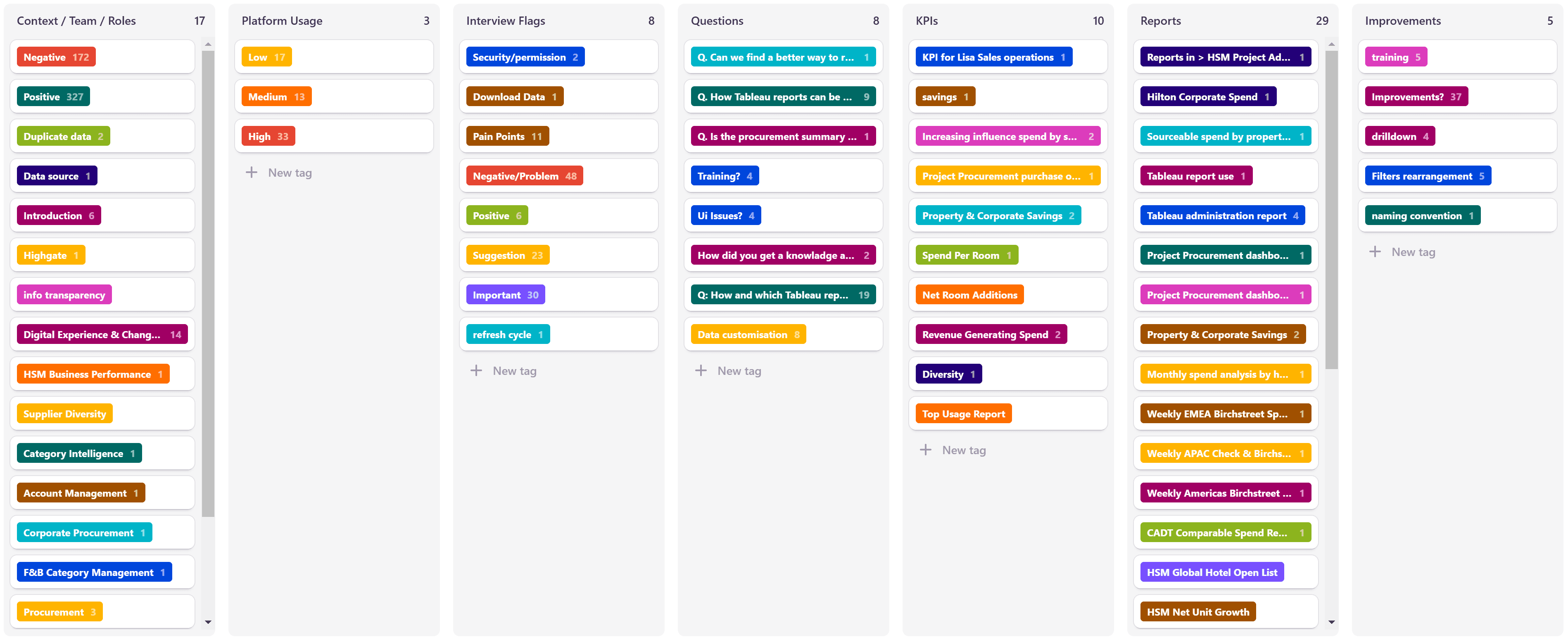
We used Dovetail to synthesize and cluster feedback into clear problem areas and opportunities.
Pain points
💻 "Reports take forever to load. Every time I click one filter, and then I have to wait—it slows me down every time."
– Operations Manager
🔍 "I just want to find the data I need, but the filters aren’t helping. I have to sift through so much irrelevant information."
– Food & Beverage Category Manager
📊 "Exporting reports is a nightmare. There are too many options that are unnecessary for me and I can’t remove them. They make me so confusion and I have to spend extra time fixing and cleaning up the Excel files afterward."
– Accountants
🎨 "The visual elements in reports are confusing and not consistent. I’m not always sure what the colors mean, and the labels don’t explain it clearly."
– Account Director
🧭 "The reports are hard to read. The layout makes it difficult to follow the data, and I get lost scrolling side to side to find what I need."
– Regional Operations Lead
👤 "I was new, and I had no clue where to start. A better guide or onboarding process would have helped me a lot."
– Beverage Procurement Specialist
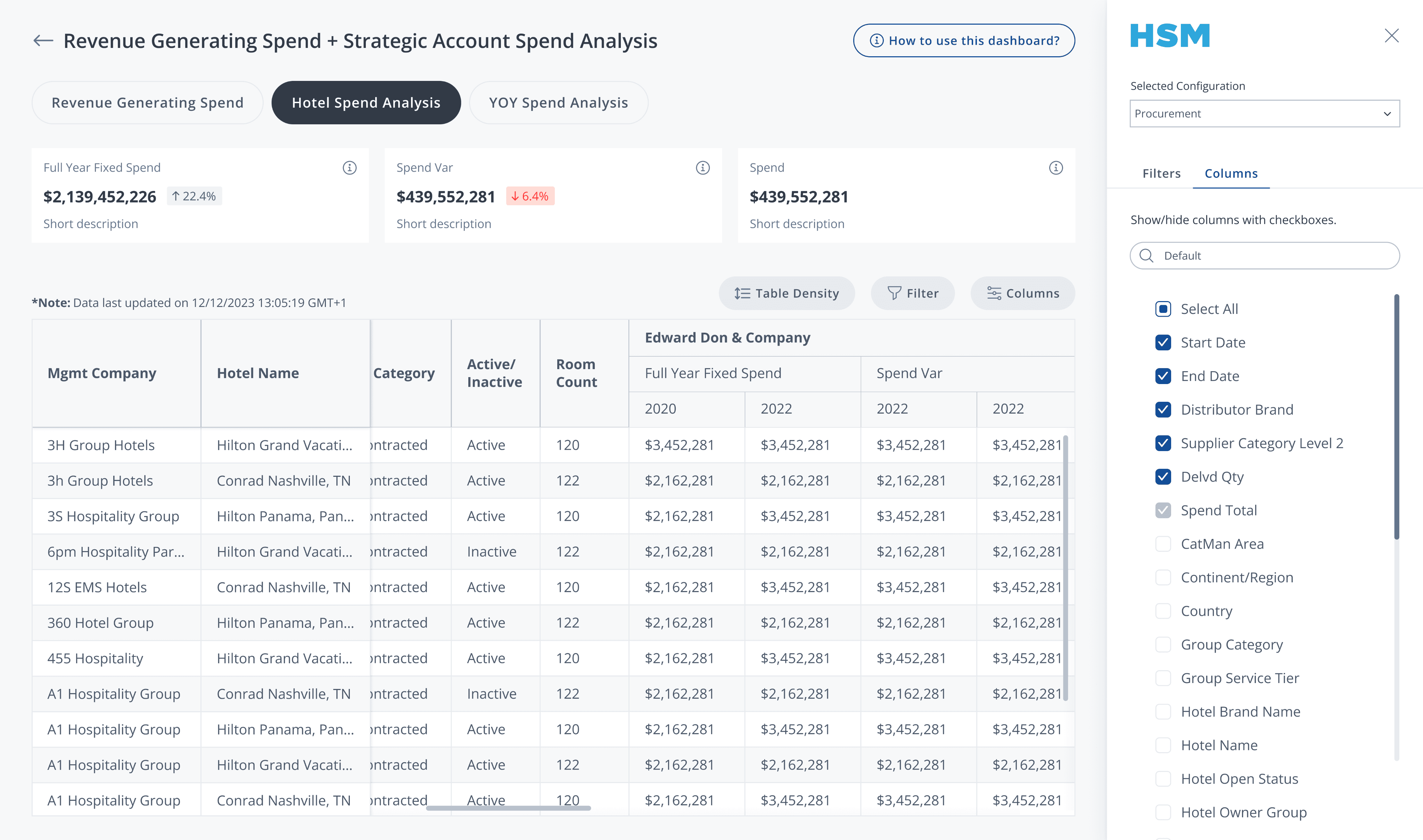
HSM’s Tableau platform before


Design Requirements
01
Faster Load Times
Improve loading and exporting performance by optimizing data processing and reducing unnecessary report rendering.
02
Report Customization
Users requested greater control over what data is shown and how reports are structured:
Add/remove specific columns.
Drag to reorder columns based on user priorities.
Apply custom filters for precision.
Save personalized report configurations for recurring tasks.
03
Onboarding & Training Support
Include an embedded guide for ongoing team training and user self-service discovery.
04
KPI Snapshots for Confidence
Design report snapshots (KPI summaries) that instantly confirm the user is in the correct report.
05
Clarity and Consistency UI
UI Improvements:
Align with global design.
Enhance visual hierarchy and readability.
Provide consistent visual cues.
Key Improvements
01
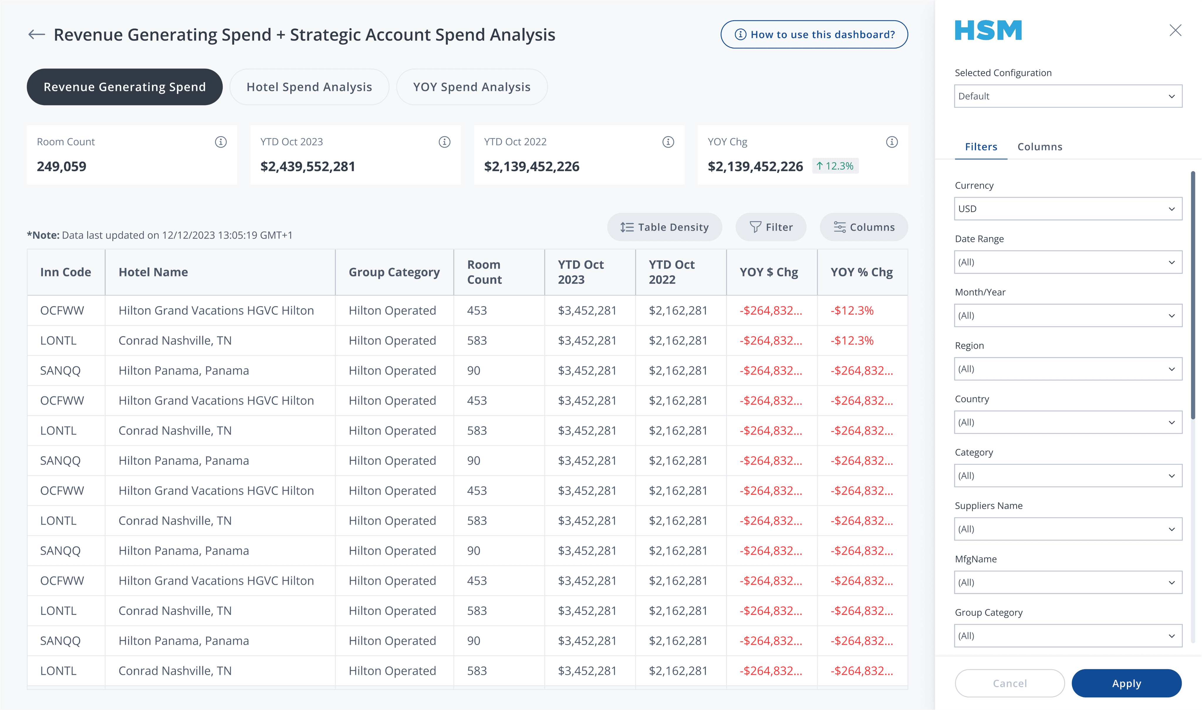
Redesign a filter and column configuration sidebar to allow users to complete all their setting before apply them and load filtered data at once.
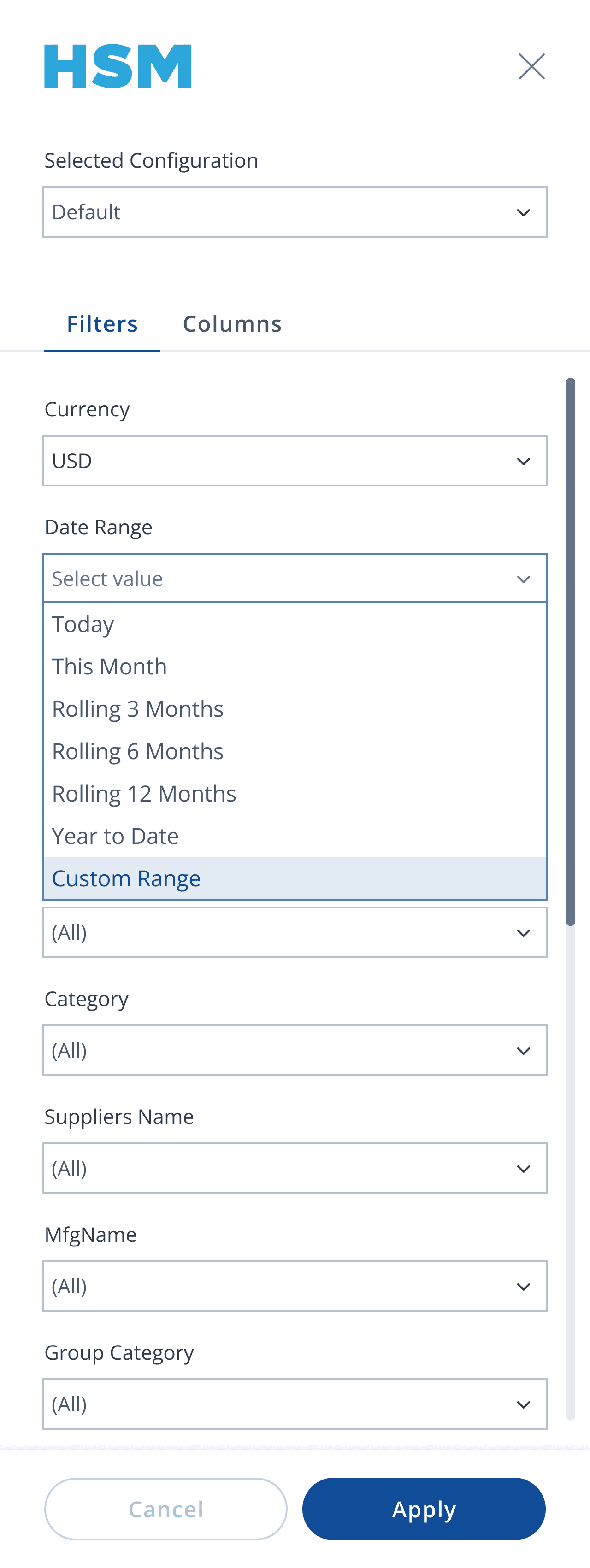

Custom Date Filter
Users can define specific date ranges to avoid loading unnecessary data and save waiting time.
Su
Mo
Tu
We
Th
Fr
Sa
29
30
1
2
3
4
5
6
7
8
9
10
11
12
13
14
15
16
17
18
19
20
21
22
23
24
25
26
27
28
29
30
31
1
2
3
4
5
6
7
8
9
Su
Mo
Tu
We
Th
Fr
Sa
27
28
29
30
31
1
2
3
4
5
6
7
8
9
10
11
12
13
14
15
16
17
18
19
20
21
22
23
24
25
26
27
28
29
30
31
1
2
3
4
5
6

Column Select & Reorder
Users can pick only the fields they need and arrange them in their preferred order.

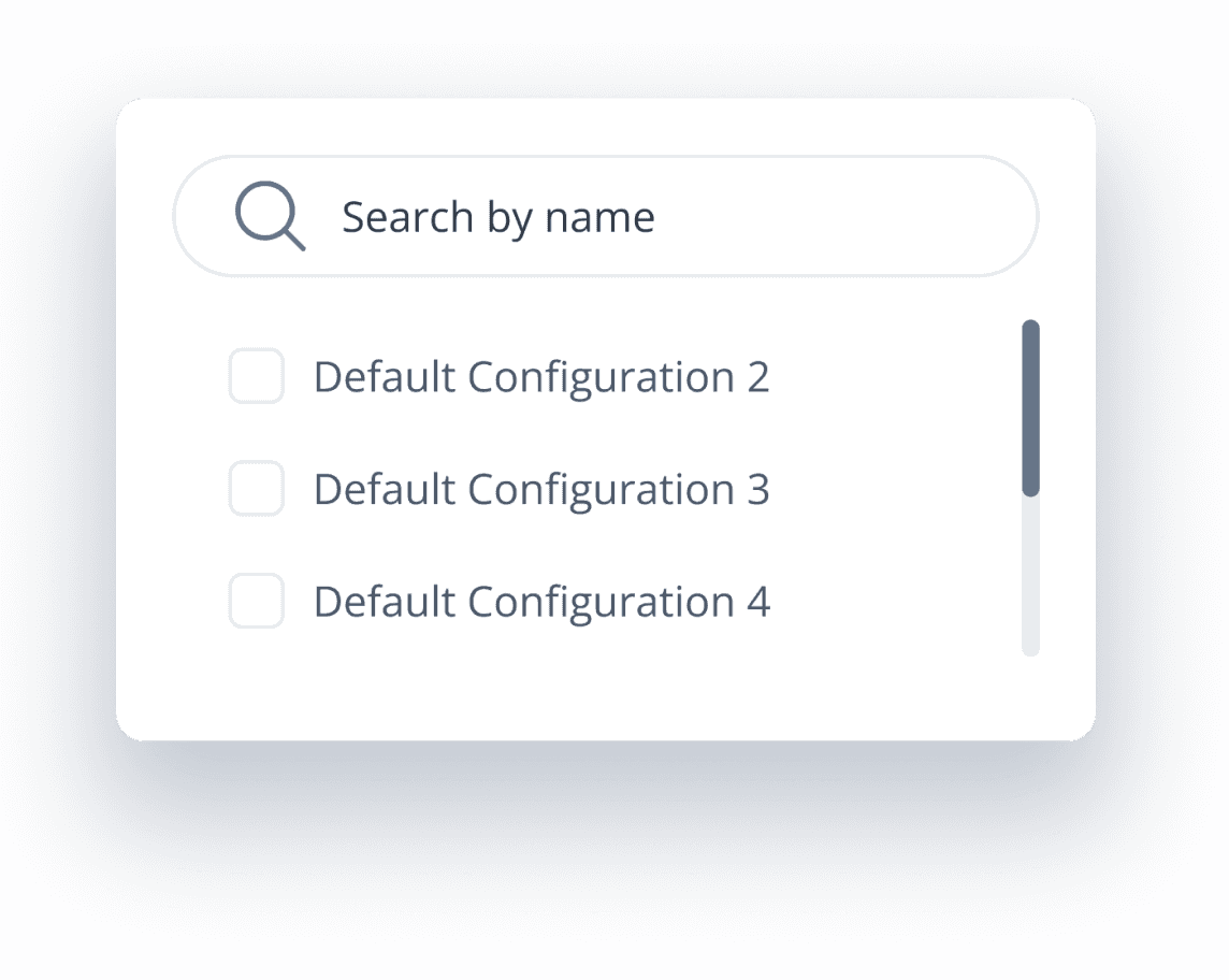
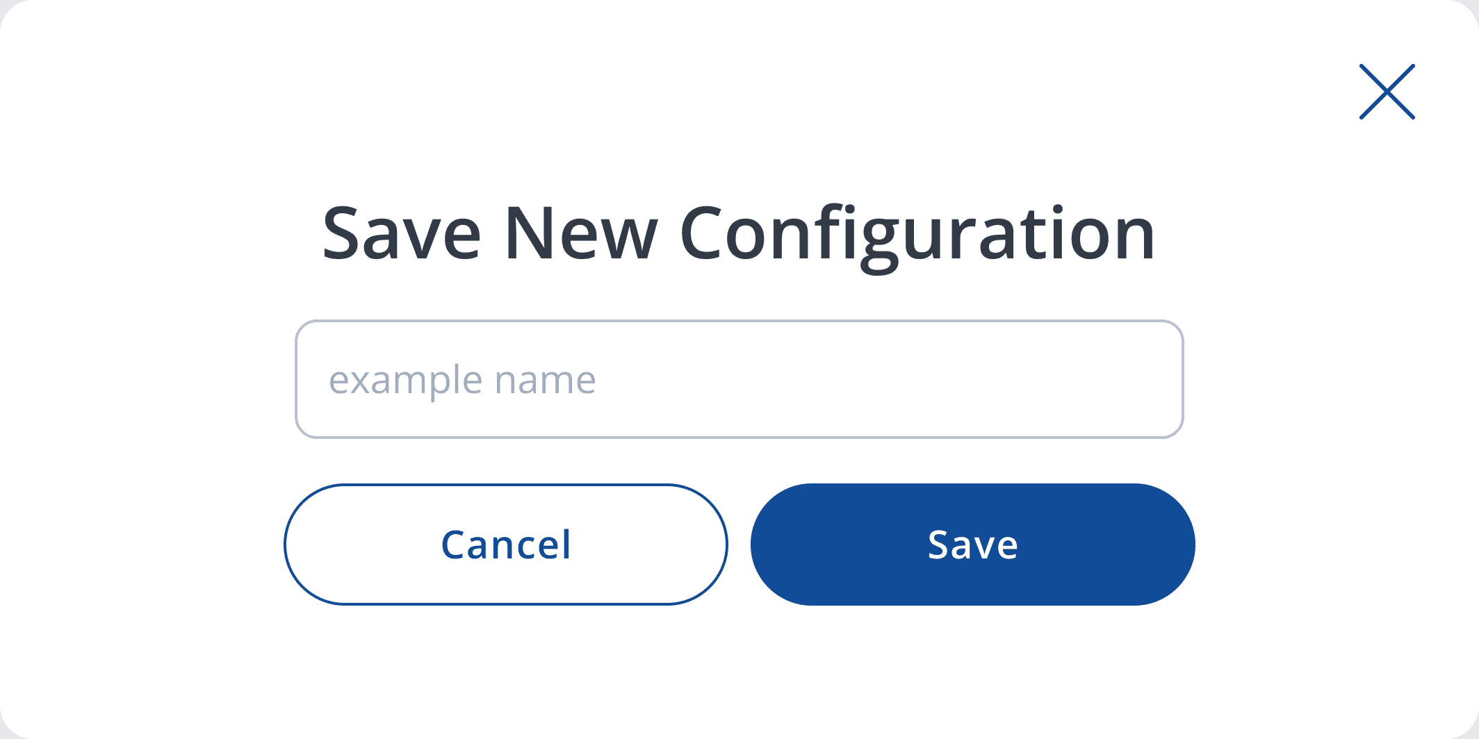
Save Configuration
Pop-Up
After making changes, users are prompted to save their report configuration for future reuse.

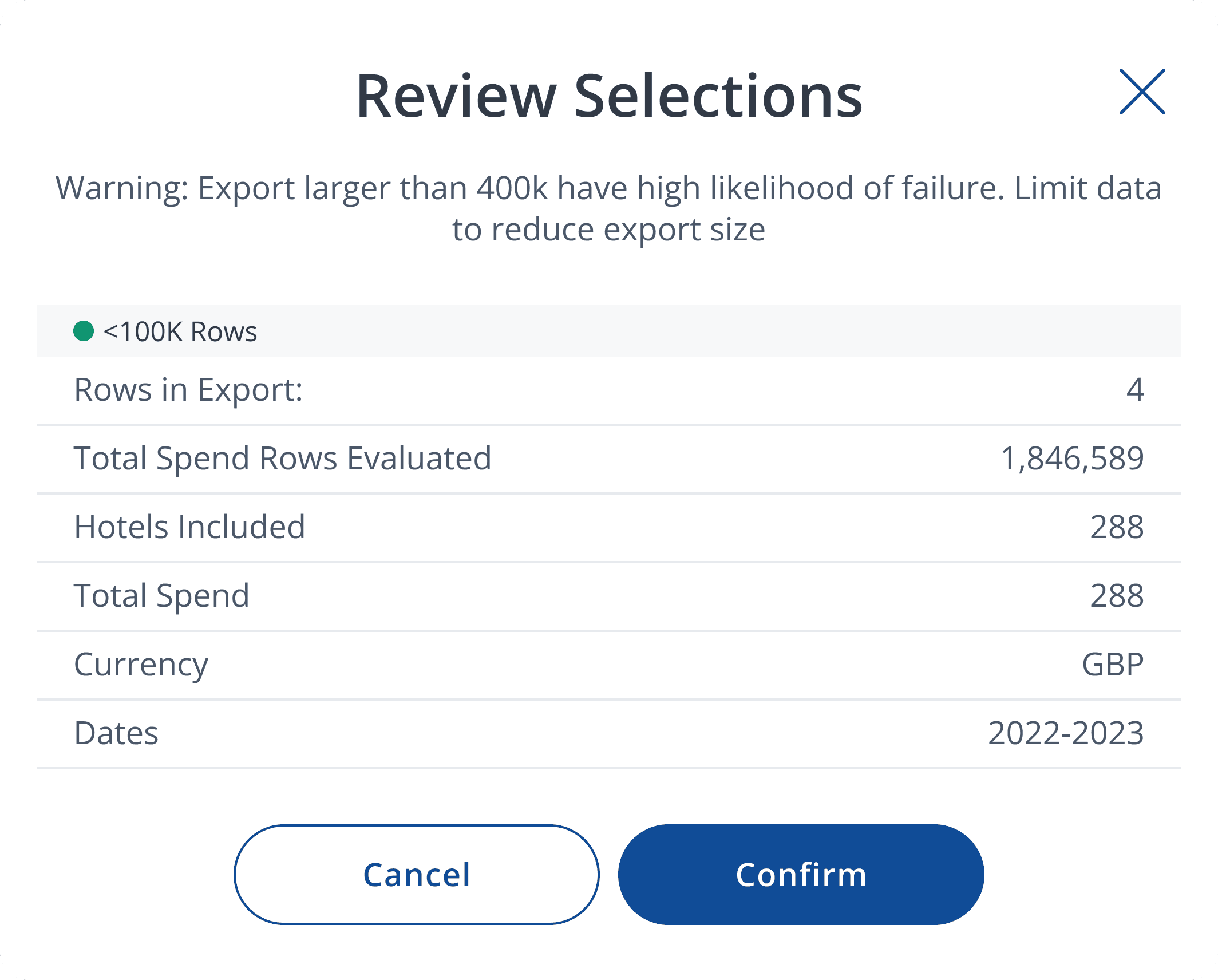
Export Preview Box
When exporting, a review box appears to confirm selected data. It includes color-coded indicators to show expected data volume to reduce errors and failure during export.


02
Introduced a tutorial button available on all report pages. It remains accessible at all times so users can revisit it when needed.

03
Enhanced Readability and Clarity for Complex Tables


Highlighted KPIs
Each report now begins with clearly labeled KPIs and visual indicators that reassure users they’re in the right place.
Adjustable Table Density
Users can adjust between compact or spacious views depending on their preference for scanning tables.
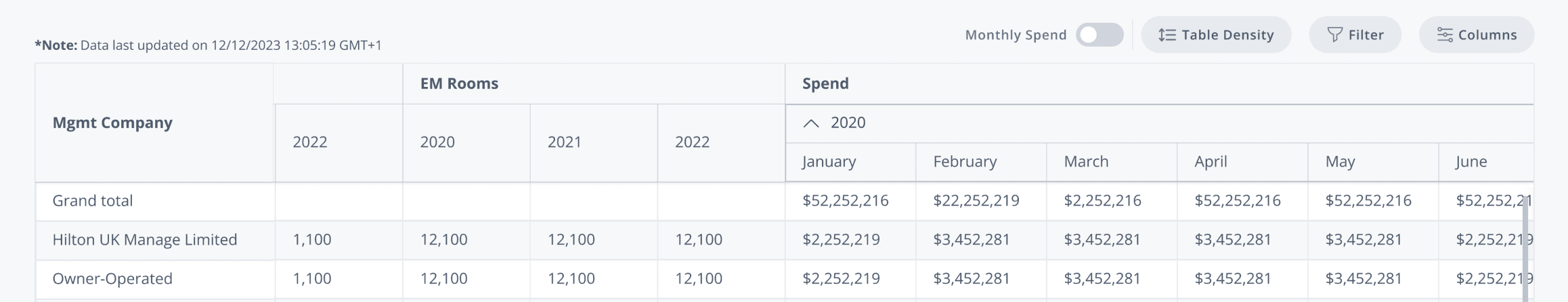
Consolidated Yearly/Monthly Views
Before: Reports with both yearly and monthly data are sperate into 2 tables, make it has repeat column and both tables are small to read.
I redesigned these into a single unified table:
Yearly data is shown by default.
A dropdown reveals monthly data inline.
An expand toggle reveals all monthly data at once, reducing clicks and keeping the layout clean.

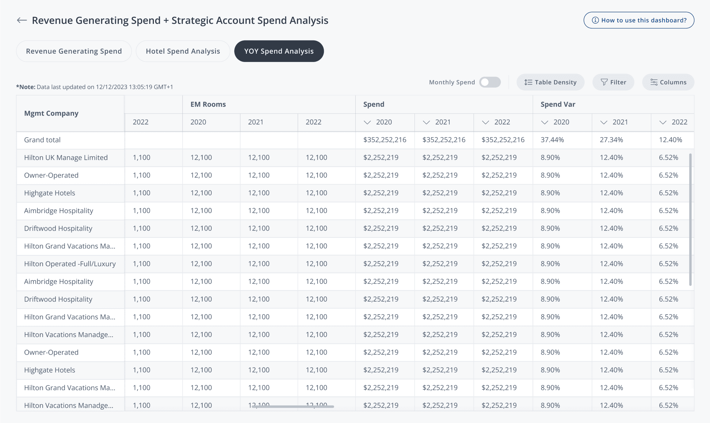
Before
After

04
System-Aligned Component Design
I redesign elements in Tableau report system and create report-related components, following HSM’s design system for consistent visual language and future scalability.

Summary
By end-to-end revamping of Hilton’s enterprise reporting platform in Tableau, we transform a slow, fragmented experience into a streamlined, user-friendly system. The new design not only aligned with Hilton’s design system, but also drove measurable improvements in efficiency, accuracy, and adoption across departments.
60%
faster task completion: filtering and preparing reports dropped from ~10 min to ~4 min
93%
of users no longer need to manually clean Excel files post-export
76%
adoption of the new “Save Configuration” feature within the first month
Check out more...